The Paris AtlasCharting the artists, works, and places worth returning to.
  • Designer
  • Painter
· French · 1901–1968

A. M. Cassandre

French poster designer whose advertisements for railways, liners and aperitifs — Nord Express, Dubonnet, Normandie — reduced their subjects to a few commanding shapes.

Details

Lived
1901–1968
Born
1901-01-24
Birthplace
Kharkiv, then Russian Empire, now Ukraine
Birth name
Adolphe Jean-Marie Mouron
Died
1968-06-17
Place of death
Paris, France
Nationality
French
Roles
DesignerPainter

About A. M. Cassandre

A. M. Cassandre (24 January 1901–17 June 1968), born Adolphe Jean-Marie Mouron, was a French poster artist, graphic designer, typographer, painter, and theatrical designer. Born in Kharkiv, then part of the Russian Empire and now in Ukraine, he became one of the most influential figures in European advertising between the world wars. His railway and ocean-liner posters transformed machines into monumental images of speed, power, and elegance, while his advertisements for everyday products demonstrated how humor and geometric simplicity could make a commercial message memorable. Although closely associated with Art Deco, his work drew on a broader range of modern art, particularly Cubism and Purism.[1]

Cassandre’s best-known designs include Nord Express, Étoile du Nord, the Dubonnet advertising campaign, and the poster for the ocean liner Normandie. He also created the typefaces Bifur, Acier, and Peignot, and later designed the intertwined initials of Yves Saint Laurent. His reputation as a commercial artist, however, tells only part of his story. Painting remained a central personal ambition, and his second career in theater produced distinguished work for opera, ballet, and spoken drama.[2]

Early Life Between Ukraine and France

Cassandre was born into a prosperous French family established in Kharkiv, historically known as Kharkov. His father, Georges Mouron, had left southwestern France as a young man to enter a relative’s wine-importing business; his mother, Eléonore Poque, came from a family with French and Baltic connections. The youngest of five children, Adolphe was called “Dola” at home. His childhood alternated between schooling in Paris and holidays in Ukraine, giving him an unusually international upbringing. The First World War disrupted this arrangement: his elder brother Henri was killed in action, the family settled in Paris in 1915, and the Russian Revolution subsequently ended his father’s hopes of maintaining the business.[3]

After his secondary education at the Lycée Condorcet, Mouron pursued painting. He studied with Lucien Simon and attended independent art academies, including the Académie Julian. According to his son’s account, his encounter with the more rigid teaching of the École des Beaux-Arts was exceptionally brief: he attended a single session in Fernand Cormon’s studio and never returned. An early encouragement came in 1919, when he placed third in a competition organized by Michelin. Advertising offered a practical means of earning money, but it also presented an alternative to academic painting—a form of art encountered in ordinary life rather than confined to exhibitions.[3]

During the early 1920s, he began producing commercial designs and adopted the professional name Cassandre. Work associated with the Paris printing firm Hachard included advertisements for such unglamorous products as margarine and pasta. These assignments were initially a livelihood rather than the fulfillment of his ambitions as a painter. Nevertheless, the challenge of making an image communicate immediately increasingly absorbed him, and commercial work became the field in which he established his reputation.[4]

The Breakthrough: *Au Bûcheron*

Cassandre first attracted widespread attention with Au Bûcheron in 1923, an advertisement for a Paris furniture store whose name meant “At the Woodcutter.” Instead of displaying furniture or illustrating a comfortable domestic interior, he concentrated on the forceful figure of a man wielding an axe. The body, tree, and surrounding space became a coordinated arrangement of angular planes. It was an unusually assertive image for a furniture advertisement, giving a commercial business the visual force of a public monument.[5]

The poster’s success was not unanimous. It provoked criticism in L’Esprit nouveau, the journal associated with Le Corbusier’s Purist ideas. The episode is revealing because Cassandre himself admired the architect’s thinking about proportion and geometric organization. His emergence was therefore not simply a case of commercial art borrowing an avant-garde style and receiving its creators’ approval: the relationship could be contentious. The Bûcheron designs nevertheless brought him major recognition at the 1925 Exposition internationale des arts décoratifs et industriels modernes in Paris, establishing him among the leading young poster artists of the period.[6]

His increasingly sophisticated handling of communication appears in L’Intransigeant of 1925, designed for the Paris newspaper. A schematic head receives converging telegraph wires at its ear, while its open mouth suggests the announcement of news. The newspaper’s name cuts diagonally across the composition, becoming part of the image rather than an explanatory caption. Cassandre compressed a complicated process—the gathering and dissemination of information—into a single memorable configuration. The face is not a portrait but an instrument of communication, and the geometry gives the advertisement both its meaning and its force.[7]

Marriage, Friendships, and Professional Partnerships

In 1924, Cassandre married Madeleine Cauvet, who came from a family connected with the early French automobile industry. Their son Henri was born the following year. Henri would later become an important interpreter of his father’s work, combining family recollections with close analysis of his designs. The marriage provided a more secure domestic setting during the years of Cassandre’s rapid professional ascent.[3]

Architecture also entered his domestic life. He commissioned Auguste Perret to design a house in Versailles, where he settled in 1925. His professional circle expanded to include Charles Peignot, whose family firm, Deberny & Peignot, would publish his most important early typefaces. Another crucial associate was Maurice Moyrand, an advertising and printing professional who became both a close friend and an effective supporter of his work. Moyrand’s death in 1934 was a serious personal loss during an otherwise highly productive period.[8]

In 1930, Cassandre, Moyrand, and the poster artist Charles Loupot established the Alliance Graphique. The enterprise connected artistic invention with the practical business of publishing advertising. Cassandre belonged to a generation that also included Jean Carlu and Paul Colin, designers who helped bring modern painting’s experiments into the commercial street. These artists did not share a single style, but together they made the poster a major vehicle for the visual culture of interwar Paris.[1]

Artistic Style and Influences

Cassandre’s mature style combined simplified forms, emphatic lettering, dramatic scale, and a carefully controlled relationship between flat surfaces and implied depth. Cubism supplied an important example of how objects could be reorganized into geometric structures rather than copied from appearances. Fernand Léger’s monumental treatment of modern subjects and Purism’s interest in order and clarity were particularly relevant. His railway imagery also shared Futurism’s fascination with speed and machinery. His compositions generally retained a stability and discipline quite different from the agitation of many Futurist paintings.[1]

His work was modern in appearance without depending entirely on the newest reproductive techniques. Painting, drawing, and airbrushing remained important to the French poster artists of his generation. In Cassandre’s designs, smooth gradations could make a locomotive seem metallic or give an enormous ship a sculptural presence, while sharply defined edges preserved the clarity required for reproduction. The resulting images occupy a productive middle ground: they are neither naturalistic illustrations nor purely abstract compositions. Their distortions serve a specific communicative purpose.[9]

Cassandre also developed a theory of the poster as an object with its own obligations. He distinguished three interconnected problems: optical, graphic, and poetic. An advertisement had to be noticed, its visual language had to be intelligible, and the combination of image and word had to provoke associations strong enough to remain in memory. He compared the designer’s role to that of a telegraph operator transmitting a message, rather than a painter pursuing unrestricted self-expression. This distinction helped explain his extraordinary concentration on clarity, but it also exposed a tension that would become increasingly important in his life: the successful commercial designer did not necessarily satisfy the ambitions of the private painter.[10]

Railway Posters: Giving Form to Speed

*Nord Express*

In Nord Express of 1927, Cassandre placed the viewer close to the level of the rails. The locomotive becomes enormous, its wheels and mechanical components looming in the foreground while its body recedes along a powerful diagonal. Telegraph wires reinforce the accelerating perspective, creating an image in which the surrounding infrastructure appears to participate in the train’s movement. Rather than describing a railway journey through picturesque scenery, Cassandre made the machinery itself the attraction.[11]

The poster’s effectiveness depends on selective exaggeration. Its perspective is not merely a neutral recording of what a camera might see; it organizes the locomotive into a visual argument about power and distance. The mechanical forms remain recognizable, but unnecessary detail is suppressed. This combination of legibility and distortion is characteristic of Cassandre’s achievement: he could make an industrial subject feel monumental without losing the immediacy of an advertisement.[12]

*Étoile du Nord*

Also produced in 1927, Étoile du Nord takes a contrasting approach. The train itself is absent. Instead, tracks converge toward a star near the horizon, translating the service’s name—“Star of the North”—into an image. The rails provide both a literal reference to travel and the principal structure of the composition. Large lettering anchors the lower portion, while the distant star supplies a destination that is simultaneously geographical and imaginative.[13]

Where Nord Express emphasizes the physical mass of the locomotive, Étoile du Nord suggests the attraction of the journey ahead. Its emptiness is therefore purposeful rather than incomplete. The viewer is given enough information to understand the railway service, but the poster leaves room for anticipation. Together, these two works show that Cassandre’s railway advertising was not a repeated formula: he could promote modern transportation through either overwhelming machinery or an almost abstract arrangement of rails, light, and distance.[13]

Ocean Liners and the Monumentality of *Normandie*

Cassandre applied related ideas to maritime advertising, including work for L’Atlantique in 1931 and Normandie in 1935. Ships offered an especially suitable subject for his combination of architecture, engineering, and theatrical scale. Their immense hulls could be reduced to a few commanding forms without sacrificing their identity, while a carefully chosen viewpoint could transform a commercial vessel into an emblem of modern luxury.[14]

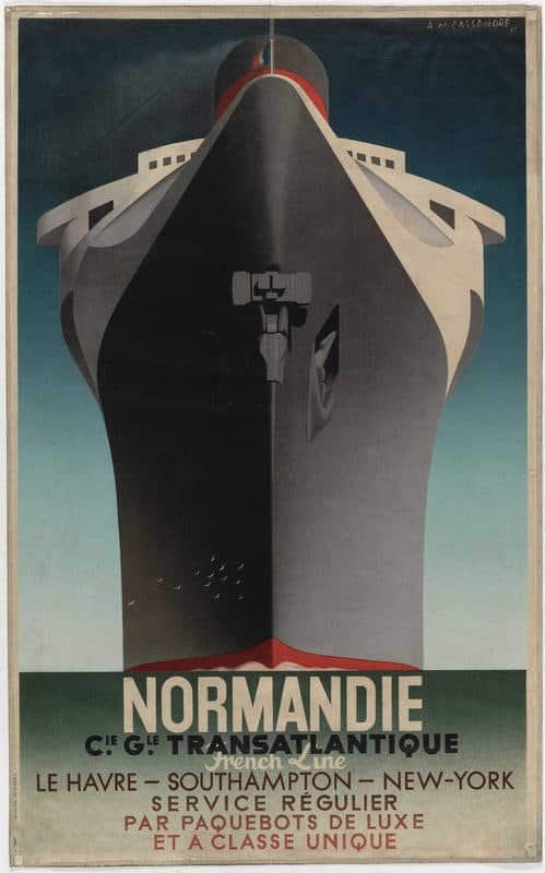
The Normandie poster is among his most accomplished statements of this approach. Viewed directly from the front, the liner’s bow rises almost the full height of the sheet. Light and shadow divide the dark hull, pale superstructure spreads to either side, and a red accent draws attention upward toward the funnel. Small birds near the lower hull provide an understated indication of scale. The image does not depend on passengers, fashionable clothing, or luxurious interiors to establish prestige; the ship’s presence does the work.[15]

Dubonnet: Humor and Sequential Advertising

The Dubonnet campaign, introduced in 1932, reveals a more playful side of Cassandre’s imagination. Its central character is a seated man in a bowler hat, reduced to a compact arrangement of geometric forms. In the celebrated three-part sequence, the man considers his drink, drinks it, and pours another glass. As the action proceeds, his body becomes progressively filled with color, while the lettering develops through “Dubo,” “Dubon,” and finally “Dubonnet.” Image, action, and brand name advance together.[12]

The campaign works as a miniature narrative whose stages can be understood almost instantly. Its comedy depends less on facial expression than on posture, repetition, and the improbable transformation of the figure. Individual versions could also function independently: the fully colored man pouring a drink remained a sufficiently distinctive emblem to identify the product. Compared with the imposing machinery of the transport posters, Dubonnet shows how readily Cassandre could exchange grandeur for familiarity without abandoning his structural precision.[16]

The figure also demonstrates his ability to create an advertising personality without detailed characterization. The bowler hat, chair, table, bottle, and glass establish a recognizable situation, but the man remains schematic enough to serve as a repeatable commercial symbol. The advertisement’s central invention is not simply a clever drawing; it is a coordinated relationship between a character, a sequence of actions, and the gradual completion of a name.[16]

Typography: Bifur, Acier, and Peignot

Typography was not a secondary skill in Cassandre’s practice. The word could generate the image, determine its proportions, or become the principal visual event. His collaboration with Deberny & Peignot extended this interest from lettering for particular commissions to typefaces that other designers and printers could use. These projects investigated how much a letter could be altered while remaining identifiable, and how the alphabet might acquire an appearance appropriate to modern life.[17]

Bifur, published in 1929, was his most radical early experiment. Its capitals are constructed from strongly simplified components, with broad strokes and contrasting areas that can be expressed through fine parallel lines. The letters demand attention rather than disappearing into effortless reading. Cassandre explicitly conceived Bifur for advertising: it was suited to an isolated word or brief declaration, not to an uninterrupted page of prose. Its strangeness was functional, intended to arrest the eye and restore the word’s force as an image.[18]

Acier, introduced in 1930, explored a different combination of geometric lettering and tonal contrast. Its name means “steel,” and the black-and-gray treatment gives the characters a distinctly manufactured appearance. It belongs to the same visual world as Cassandre’s industrial posters, but transfers that impression into the alphabet itself. The typeface shows how he could suggest material qualities without turning letters into literal pictures of objects.[8]

Peignot, launched in connection with the Paris International Exhibition of 1937, was more ambitious in its intended scope. Cassandre looked back to the Roman capital and questioned the conventional separation between uppercase and lowercase forms. The resulting alphabet combined monumental qualities with an unusual mixed-case appearance. Its slender lines, marked contrasts, and distinctive letter shapes created an elegance quite different from a uniform, utilitarian sans serif. Peignot illustrates an important feature of his modernism: innovation could emerge through a reconsideration of historical forms rather than through their wholesale rejection.[19]

International Recognition and the American Years

In 1936, the Museum of Modern Art in New York devoted an exhibition to Cassandre’s posters, now recorded in its exhibition history as running from 14 January to 16 February. This was a significant acknowledgment of commercial graphic design within a museum dedicated to modern art. Posters created for streets, stations, and advertising sites were being considered as works deserving sustained attention in their own right.[20]

Cassandre subsequently worked for Harper’s Bazaar, collaborating with its influential art director Alexey Brodovitch. His American commissions allowed him to explore imagery less closely tied to the architectural severity of the early posters. One striking advertisement for Ford centered on an enormous eye rather than a prominently displayed automobile. Such work depended on surprise and psychological association, bringing his commercial imagery closer to the dislocations associated with Surrealism.[5]

American recognition did not produce uniformly successful commercial results. His son described the experience as mixed: the magazine covers attracted admiration, but his poster work did not achieve the response hoped for by advertising agencies. Meanwhile, his encounter with Balthus and his painting in the mid-1930s strengthened Cassandre’s desire to return to the easel. During his second New York winter, he painted still lifes in his hotel room, repeatedly destroying work that dissatisfied him. The episode suggests not a sudden abandonment of design but a prolonged reassessment of what he wanted his art to accomplish.[21]

War and the Renewed Pursuit of Painting

Cassandre returned to France before the Second World War. His first marriage broke down, and he entered military service after the declaration of war, working first as an artilleryman and later with the army’s geographical service. Following demobilization in 1940, painting occupied an increasingly important place in his life.[21]

In December 1942, the Galerie René Drouin in Paris exhibited his paintings, including a substantial portrait of Coco Chanel. Through Chanel he met the poet Pierre Reverdy, with whom he developed a close friendship and an active correspondence. He also painted portraits of patrons such as Marie-Laure de Noailles and produced landscapes during stays outside Paris. These works moved away from the immediate public address of advertising toward a more personal examination of people, places, and pictorial atmosphere.[22]

His interest in painting included technical experimentation. Giorgio de Chirico had discussed egg-based painting with him in New York, and Cassandre later investigated the medium as an alternative to the difficulties he encountered in oil. Among the works associated with this later phase was Le Baladin, painted in 1950. His development as a painter was therefore not merely a retreat into an earlier ambition: it involved continuing questions about materials, density, surface, and the relationship between controlled execution and spontaneous expression.[22]

Theater, Ballet, and Opera

Cassandre’s theatrical career had begun before the war. Louis Jouvet commissioned sets and costumes for Jean Giraudoux’s Amphitryon 38, represented in the performance record by a 1934 production. Theater offered a natural meeting point for his interests in painting, architecture, and the organization of attention. A stage setting, like a poster, needed to establish a coherent visual world, but it also had to accommodate bodies, movement, dramatic action, and changing light.[23]

His work for ballet became particularly important. He designed for Serge Lifar’s Le Chevalier et la Damoiselle in 1941 and later collaborated with Lifar and the composer Henri Sauguet on Les Mirages. First performed at the Paris Opéra on 15 December 1947, Les Mirages involved Cassandre not only as the designer of scenery and costumes but also as a co-author of the ballet’s scenario. His contribution therefore extended into the conception of the dramatic work itself.[23]

One of his most important operatic achievements was Mozart’s Don Giovanni at the Festival d’Aix-en-Provence in 1949. Directed by Jean Meyer and conducted by Hans Rosbaud, the production opened on 18 July in the courtyard of the former Archbishop’s Palace. Cassandre supplied both scenery and costumes. He was also involved in devising the temporary theatrical structure, making the project an unusually comprehensive exercise in shaping the conditions of performance.[24]

His stage work eventually encompassed productions of Molière, Shakespeare, Giraudoux, and Racine, with collaborators including Meyer and Jean-Louis Barrault. The range matters because it prevents his theatrical career from being treated as a decorative appendix to his posters. He worked across different kinds of drama, from comedy and ballet to opera and tragedy, developing a substantial professional identity beyond advertising. His sets and costumes for Racine’s Phèdre in 1959 belong to the final phase of this sustained involvement with the stage.[23]

Later Design and the Yves Saint Laurent Monogram

Cassandre did not entirely stop graphic design after turning toward painting and theater. His postwar work included record sleeves, advertisements, lettering, and typefaces for Olivetti typewriters. These projects required a quieter kind of invention than the monumental transport posters, but they continued his investigation of letters as expressive forms. The later work often placed greater emphasis on the movement and rhythm of lettering rather than on the emphatic geometry of his earliest alphabets.[22]

His second marriage, to Nadine Robinson in 1947, also connected him with the fashion world: she had worked as a dress designer for Lucien Lelong. They divorced in 1954. Professional recognition continued, including a retrospective at the Musée des Arts Décoratifs in Paris in 1950 and his promotion to officer of the Legion of Honor in 1962. These honors coexisted with growing uncertainty about his work and future rather than resolving it.[8]

His most enduring late commission came from Yves Saint Laurent and Pierre Bergé. The Musée Yves Saint Laurent Paris dates their request for a house logo to 1961, although the monogram is frequently dated 1963 in broader accounts of Cassandre’s career. The museum’s chronology places the commission at the foundation of the couture house.[25]

The intertwined Y, S, and L show the mature refinement of Cassandre’s lettering. Each initial remains readable while participating in a single compact figure. The curved S connects the angular forms of the Y and L, and the changing thickness of the strokes gives the design both firmness and fluidity. Unlike the transport posters, the monogram requires no accompanying scene to establish its character. Its entire effect is carried by the relationship between three letters, demonstrating how much visual personality Cassandre could concentrate into very little material.[25]

Final Years and Death

Cassandre’s final years were marked by continuing artistic activity alongside depression and increasing discouragement. In 1963, he moved to the Bugey region near his friend François Michel, considering plans for an international art institute and a house of his own. The hoped-for renewal did not materialize, and he returned to Paris in 1965. His last projects included a poster for the proposed newspaper 24 Heures, which failed before publication, and further work on a final typeface bearing his own name.[8]

His reputation had not disappeared. Exhibitions of his posters were organized in Geneva and Paris in 1966 and in Amsterdam in 1967, even as his personal condition deteriorated. After a suicide attempt in 1967, Cassandre died by suicide at his apartment on Avenue René-Coty in Paris on 17 June 1968, aged sixty-seven. He was buried in Montparnasse Cemetery.[8]

What was found on his desk points at the last thing that failed. Through 1967 he had been drawing an alphabet carrying his own name, together with an adaptation of it called Metop. The foundries withdrew, and neither was published while he lived. The estate records that the letter lying on his desk came from a type foundry across the Rhine, refusing the typeface as subversive. The Metop lettering was used after his death for the signage of the ski resort at Flaine.[26]

The published accounts do not state a method, and none of them names a diagnosis or any treatment he received. What they do establish is the shape of the years leading to it. He had moved to the Bugey in 1963 around a plan for an international art institute that came to nothing. He returned to Paris in 1965. A late poster commission collapsed when the newspaper that ordered it folded before publication. He was sixty-seven, still being exhibited in three countries, and unable to get into production the work he cared most about.[8][26]

Connection to Paris

Paris was central to Cassandre’s artistic formation and to the public life of his work. After attending school in the city during his childhood, he settled there with his family in 1915 and later pursued painting at the Académie Julian.[3] His breakthrough poster, Au Bûcheron (1923), advertised a Paris furniture store, while L’Intransigeant (1925) turned the capital’s newspaper industry into an image of modern communication.[5][7] These commissions placed his geometric designs within the everyday commercial culture of the city, rather than solely within its galleries. His Paris connections also extended to the stage and to personal friendships: he worked with Louis Jouvet, collaborated with Serge Lifar on Les Mirages at the Paris Opéra, and met the poet Pierre Reverdy through Coco Chanel.[23][22] In 1961, Yves Saint Laurent and Pierre Bergé commissioned the intertwined YSL monogram, connecting Cassandre’s typography with the identity of a Paris couture house.[25] He died in Paris in 1968 and was buried in Montparnasse Cemetery.[8]

Legacy

Cassandre’s influence rests on more than the recognizability of a handful of famous images. He demonstrated that an advertisement could possess the compositional rigor of painting while responding to very different conditions of attention. The enormous locomotive, the converging railway tracks, the frontal ocean liner, and the progressively colored Dubonnet drinker each solve a distinct problem. Their power comes from the coordination of viewpoint, proportion, lettering, and association, rather than from decoration applied to a commercial message.[11]

His importance was recognized by later graphic designers, including Paul Rand, who adapted the Dubonnet figure with acknowledgment of its source. Cassandre was inducted into the Art Directors Club Hall of Fame in 1972, and his work continued to receive museum attention after his death. MoMA mounted another exhibition of his posters in 1971, while the Bibliothèque nationale de France’s major 2005 exhibition helped renew discussion of his graphic and typographic achievements.[5]

The breadth of his career also complicates the familiar description of him as an Art Deco designer. That label identifies an important historical setting, but it does not fully describe his movement between advertising, experimental typography, portraiture, landscape, opera, and ballet. Across these fields, Cassandre repeatedly examined the relationship between a lucidly constructed form and the emotion it could communicate. His lasting achievement was to make that relationship productive in objects as different as a public poster, a theatrical setting, and a three-letter monogram.[2]

---

Life events

  1. 1901

    Born Adolphe Jean-Marie Mouron on 24 January in Kharkiv, then part of the Russian Empire and now in Ukraine, to a French family.

  2. 1923

    Au Bûcheron, the poster that makes his name, and the point at which the pseudonym Cassandre takes hold.

  3. 1927

    Nord Express and Étoile du Nord, the railway posters that turn a locomotive into converging lines and distance.

  4. 1929

    Bifur, the first of his typefaces, followed by Acier and in 1937 by Peignot.

  5. 1932

    The Dubonnet campaign, three panels read in sequence — an advertisement built to be seen from a moving vehicle.

  6. 1935

    Normandie, the liner poster, drawn head-on so the bow fills the sheet.

  7. 1936

    The Museum of Modern Art gives him a solo exhibition, Posters by Cassandre, from 14 January to 16 February.

  8. 1961

    Designs the intertwined initials of Yves Saint Laurent, still the house monogram.

  9. 1968

    After a suicide attempt the previous year, he dies by suicide at his apartment on avenue René-Coty in Paris on 17 June, aged sixty-seven. He is buried in Montparnasse Cemetery.

Selected works

Cataloged from the holding institutions' records. Reproductions appear only where the rights are verified.

Posters

A poster showing an ocean liner head-on, its black bow filling most of the sheet and rising to white deck wings and a single funnel against a dark green sky. A small flock of white birds flies low across the hull, and a red band marks the waterline. Below, in heavy capitals, NORMANDIE, then Cie Gle Transatlantique, French Line, and Le Havre – Southampton – New-York.

Artwork reproduction

Poster · Art Deco

Normandie

1935 · Lithograph

A. M. Cassandre designed this poster in 1935 to advertise the French liner Normandie. He drew the ship head-on, so the bow fills the sheet and rises toward the upper decks, with a few small white birds beside the hull to give the scale. The ship's name runs in heavy letters along the bottom. The Museum of Modern Art in New York holds a lithograph of it, about a metre tall.

The Museum of Modern Art

A. M. Cassandre, Normandie, 1935. The Museum of Modern Art. Image © the rights holder, shown under fair use.

Movements

The artistic and literary currents this life ran through.

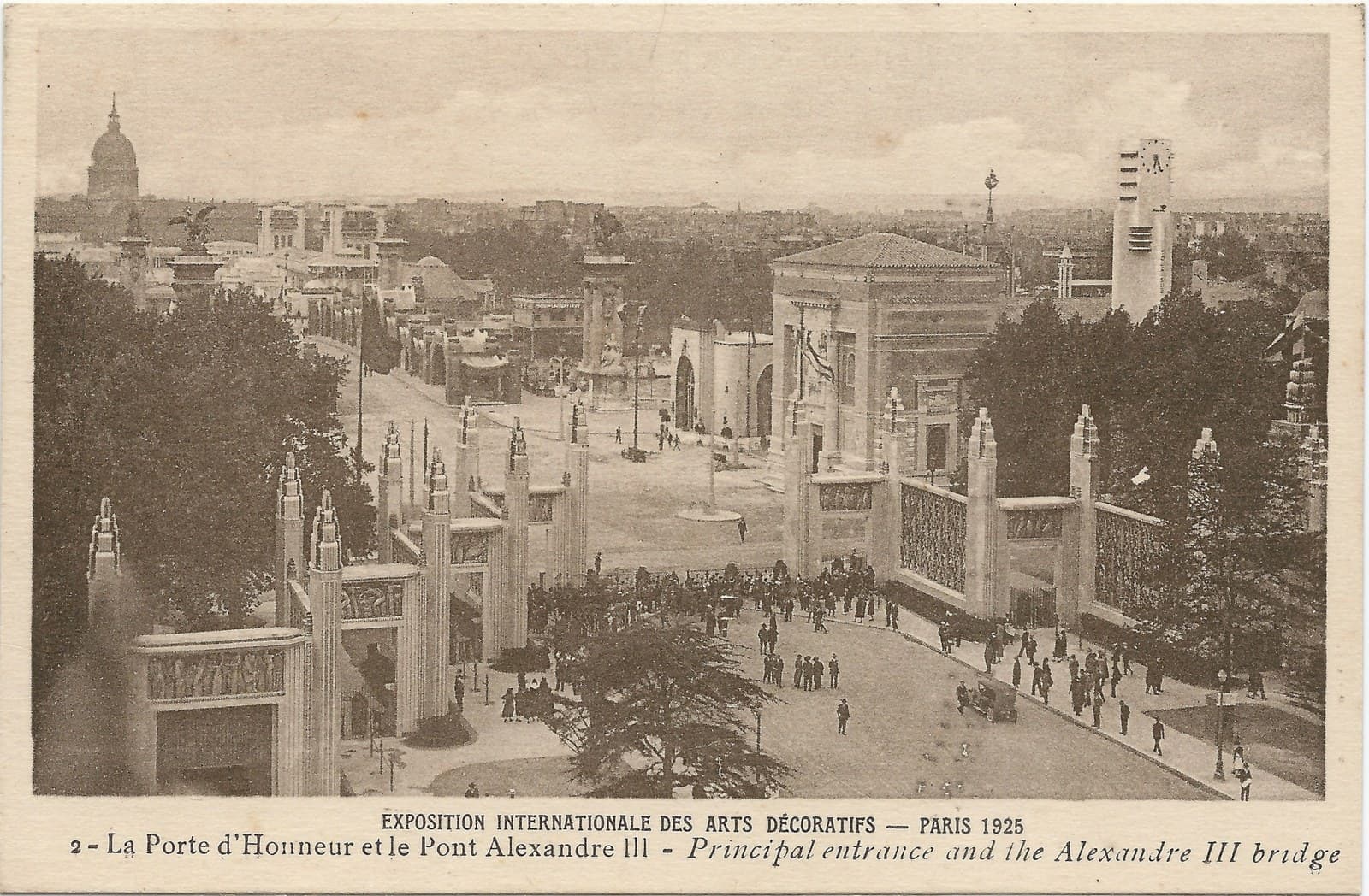
Aerial view of the 1925 Paris decorative arts exhibition: tall square pylons flanking the Porte d'Honneur entrance, crowds on the paths below, pavilions and a clock tower spreading toward the Invalides dome

Art & design movement · circa 1910–1939

Art Deco

Cassandre's posters are Art Deco working through printed commercial images rather than buildings or objects. He reduced a liner or a locomotive to a few geometric forms seen head-on, and the Museum of Modern Art gave him a solo exhibition in 1936, a year after the Normandie poster appeared.

A. M. Cassandre, Normandie, 1935 — collection record; Posters by Cassandre, 14 January – 16 February 1936 — exhibition archive

Questions about A. M. Cassandre

What was A. M. Cassandre's real name?

Adolphe Jean-Marie Mouron. He was born in Kharkiv on 24 January 1901, then part of the Russian Empire and now in Ukraine, to a French family. Cassandre was the working name he took for his poster work.

What is Cassandre best known for?

The posters Nord Express and Étoile du Nord, both 1927, the Dubonnet campaign of 1932, and the Normandie liner poster of 1935. He also drew the typefaces Bifur, Acier and Peignot, and in 1961 the intertwined YSL monogram still used by Yves Saint Laurent.

Did Cassandre design typefaces as well as posters?

Yes, three of them: Bifur in 1929, Acier, and Peignot in 1937. His lettering and his images were part of the same practice — the words in a Cassandre poster are drawn, not set.

Was Cassandre only a commercial artist?

No, though that is the reputation. Painting was a continuing personal ambition, and from the 1930s he had a substantial second career designing sets and costumes for opera, ballet and spoken drama, including Don Giovanni at the Festival d'Aix-en-Provence in 1949.

How did Cassandre die?

He died by suicide at his apartment on avenue René-Coty in Paris on 17 June 1968, aged sixty-seven, following an earlier attempt in 1967. He is buried in Montparnasse Cemetery. The published accounts do not state a method, and none names a diagnosis or any treatment. They do set out the years behind it. His last decade combined continuing work with depression and discouragement. A move to the Bugey in 1963, for a planned international art institute, came to nothing, and he returned to Paris in 1965. A poster commission collapsed when the newspaper that ordered it folded before publication. Through 1967 he drew an alphabet bearing his own name and an adaptation called Metop, and the foundries withdrew from both. The estate records that the letter on his desk when he died came from a type foundry across the Rhine, refusing the typeface as subversive. Posters of his were being exhibited in Geneva, Paris and Amsterdam over the same two years.

Connections and Sources

A. M. Cassandre’s connections to people, places, and works, with the sources behind each one.

Associated with · 1923–1939

Art Deco

Cassandre's posters are Art Deco working through printed commercial images rather than buildings or objects. He reduced a liner or a locomotive to a few geometric forms seen head-on, and the Museum of Modern Art gave him a solo exhibition in 1936, a year after the Normandie poster appeared.

A. M. Cassandre, Normandie, 1935 — collection record; Posters by Cassandre, 14 January – 16 February 1936 — exhibition archive

References

References

The sources below include biographies, scholarly essays, interviews, and primary materials that informed this page. They reflect both the historical record and ongoing critical conversations about A. M. Cassandre and their work.

  1. 1abcLife, Artistic Influences, and the Alliance Graphique - A. M. Cassandre

    Website
    Larousse
    Used for

    His artistic influences and the Alliance Graphique agency.

    View source
  2. 2abA. M. Cassandre — artist record

    Website
    The Museum of Modern Art
    Used for

    The museum's artist page, and the collection and exhibition history behind it.

    View source
  3. 3abcdChildhood, Family Background, and Education - A. M. Cassandre

    Website
    Estate of A. M. Cassandre
    Used for

    Henri Mouron's biography, chapter one: childhood, family background and education.

    View source
  4. 4Early Commercial Work - A. M. Cassandre

    Website
    Wikipedia, French
    Used for

    His early commercial work.

    View source
  5. 5abcdPoster Design, American Commissions, and Recognition - A. M. Cassandre

    Website
    The One Club
    Used for

    The Art Directors Club Hall of Fame entry: the American commissions and the recognition that followed.

    View source
  6. 6Life, Career, and Artistic Development - A. M. Cassandre

    Website
    Encyclopædia Universalis
    Used for

    Michel Wlassikoff's encyclopedia entry on his life, career and artistic development.

    View source
  7. 7abL'Intransigeant - A. M. Cassandre

    Website
    Museum of Modern Art
    Used for

    The holding museum's record for L'Intransigeant.

    View source
  8. 8abcdefgMarriages, Professional Partnerships, American Work, and Death - A. M. Cassandre

    Website
    Estate of A. M. Cassandre
    Used for

    Henri Mouron's biographical note: the marriages, the professional partnerships, the American work, and the death.

    View source
  9. 9Artistic Style and the Modern French Poster - A. M. Cassandre

    Website
    Museo Nacional Centro de Arte Reina Sofía
    Used for

    The modern French poster and where Cassandre sits among Colin, Carlu and Loupot.

    View source
  10. 10Cassandre's Ideas About Advertising and Visual Communication

    Website
    Estate of A. M. Cassandre
    Used for

    Cassandre in his own words on advertising and visual communication.

    View source
  11. 11abNord Express - A. M. Cassandre

    Website
    Museum of Modern Art
    Used for

    The holding museum's record for Nord Express (1927).

    View source
  12. 12abRailway Posters, Spatial Composition, and Mature Advertising - A. M. Cassandre

    Website
    Estate of A. M. Cassandre
    Used for

    Henri Mouron's biography, chapter two: the railway posters and his mature advertising work.

    View source
  13. 13abÉtoile du Nord - A. M. Cassandre

    Website
    Museum of Modern Art
    Used for

    The holding museum's record for Etoile du Nord (1927).

    View source
  1. 14Ocean-Liner Posters - A. M. Cassandre

    Website
    Estate of A. M. Cassandre
    Used for

    The estate's own site, and the ocean-liner posters.

    View source
  2. 15A. M. Cassandre, Normandie, 1935 — collection record

    Website
    The Museum of Modern Art
    Used for

    The holding museum's record for the Normandie poster: the 1935 date, the lithography, the 99.7 by 61.9 cm sheet.

    View source
  3. 16abDubonnet - A. M. Cassandre

    Website
    Museum of Modern Art
    Used for

    The holding museum's record for the Dubonnet campaign of 1932.

    View source
  4. 17Typography and the Relationship Between Words and Images - A. M. Cassandre

    Website
    Jérôme Peignot
    Used for

    Jerome Peignot's 1985 study of his typography and the relationship between words and images.

    View source
  5. 18Bifur - A. M. Cassandre

    Website
    Production Type
    Used for

    The Bifur typeface, and the digital revival of it.

    View source
  6. 19Peignot, Acier, and Cassandre's Typographic Legacy

    Website
    Production Type
    Used for

    Peignot, Acier and the wider typographic legacy.

    View source
  7. 20Posters by Cassandre, 14 January – 16 February 1936 — exhibition archive

    Archive
    The Museum of Modern Art
    Used for

    The 1936 exhibition archive, a year after Normandie appeared.

    View source
  8. 21abAmerican Years, Return to Painting, and Wartime Service - A. M. Cassandre

    Website
    Estate of A. M. Cassandre
    Used for

    Henri Mouron's biography, chapter three: the American years, the return to painting, and his wartime service.

    View source
  9. 22abcdPainting, Coco Chanel, Pierre Reverdy, and Theater - A. M. Cassandre

    Website
    Estate of A. M. Cassandre
    Used for

    Henri Mouron's biography, chapter four: painting, Coco Chanel, Pierre Reverdy and the theatre.

    View source
  10. 23abcdStage Sets, Costumes, and Ballet Collaborations - A. M. Cassandre

    Website
    Les Archives du spectacle
    Used for

    His professional record in the theatre: sets, costumes and ballet collaborations.

    View source
  11. 24Don Giovanni - Festival d'Aix-en-Provence, 1949

    Website
    Les Archives du spectacle
    Used for

    The 1949 Don Giovanni at the Festival d'Aix-en-Provence.

    View source
  12. 25abcYves Saint Laurent Monogram - A. M. Cassandre

    Website
    Musée Yves Saint Laurent Paris
    Used for

    The intertwined YSL monogram he designed in 1961.

    View source
  13. 26abA. M. Cassandre, biography — Adolphe Mouron (1901-1968)

    Website
    Estate of A. M. Cassandre
    Used for

    The estate's English biography: the CASSANDRE alphabet and its Metop adaptation of 1967, the foundries' withdrawal, the refusal letter found on his desk on 17 June 1968, and Metop's posthumous use in the signage at Flaine.

    View source
i
Why these sources are here

These references anchor the page in the documented record and in the scholarly conversations around A. M. Cassandre. Every claim on this page traces back to one or more of the works listed here.

Explore more resources