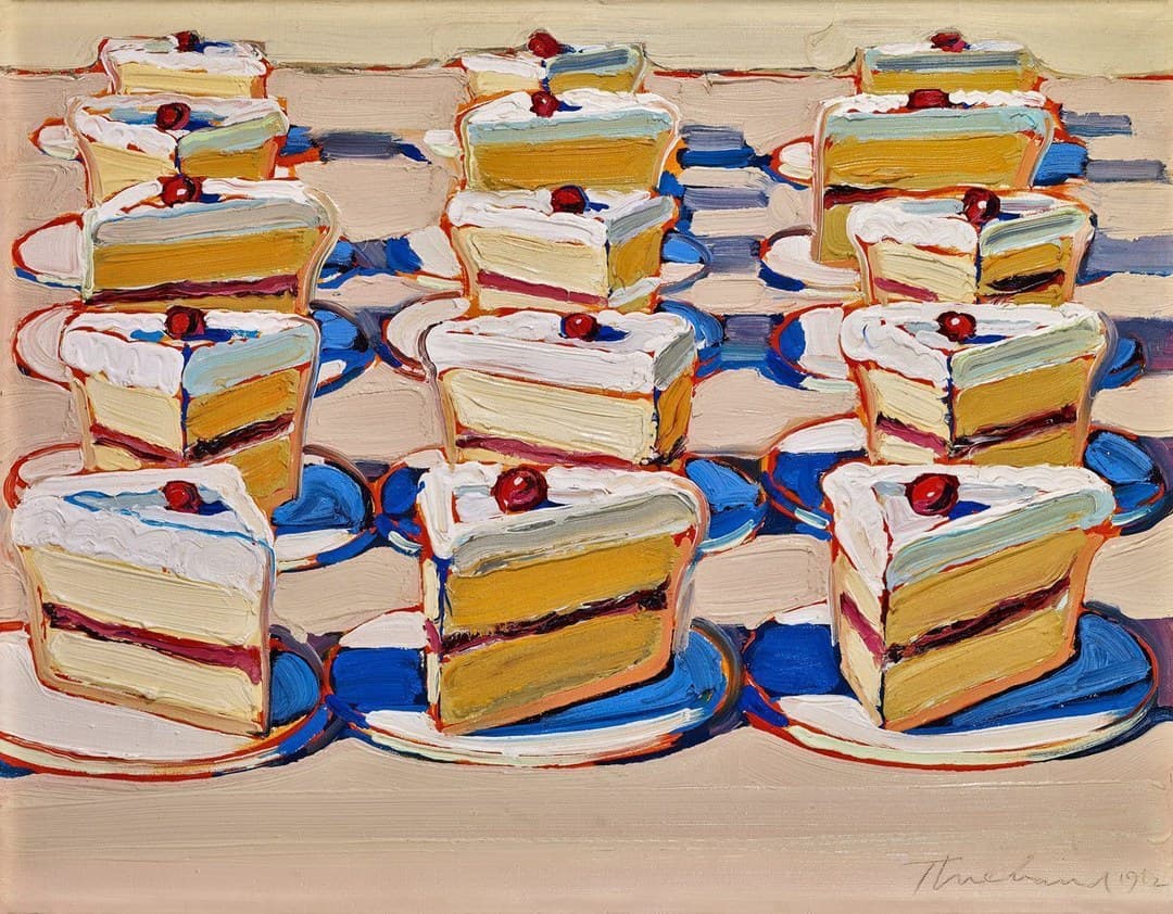
Boston Cremes
by Wayne Thiebaud
Fifteen slices of cake stand in three columns of five on a warm tan counter, each capped with white frosting and a single red cherry. Wayne Thiebaud painted it in 1962, the year of the New York exhibition that made his name. The Crocker Art Museum in his own city bought it two years later and holds it as 1964.22.
- 1962
- Oil on canvas
- Crocker Art MuseumSacramento, California, United States
What the painting shows
Fifteen cake slices stand on a warm tan counter, ranged in three columns of five. Each column runs from the top edge of the canvas to the bottom third, and the slices grow as they come forward, so the front three are roughly four times the size of the three at the back.
Every slice is built the same way. A cap of white frosting worked in scalloped ridges; a thick pale ivory layer; a band of rose-red with a dark maroon line along its upper edge; and a second pale layer below. A bright red cherry sits in a dip in the frosting of every one of the fifteen.
The counter is a warm tan near #caaf97, and a paler olive-cream strip runs across the very top of the canvas. The plates are white ellipses, each drawn with one sweep, each with a line of orange-red along its near rim.
Wayne Thiebaud signed and dated the canvas at the lower right, in thin dark script, 1962.
The title and what is on the plate
A Boston cream is a yellow cake filled with custard and glazed in chocolate. The slices Wayne Thiebaud painted do not show that. Between the cake layers runs a band of rose-red with a dark maroon line along its upper edge, and the layers themselves vary: the three at the front are a pale ivory, the slices behind them a deeper amber.
The frosting is white rather than chocolate, and it is thick. On the front slices a streak of pale blue, close to #92a3b3, runs across the frosting where the top plane turns down towards the cut face. That blue is not a shadow cast by anything; it is the colour he uses for a turning surface.
Nothing here is presented as a record of a particular cake. The Crocker Art Museum catalogues the painting under its title and gives no subject note beyond it.
Every edge is outlined in a separate colour
Follow any one slice around its outline and the colour changes as it goes. The near vertical edge carries orange-red. The shadow side carries blue, and the blue widens into a flat cobalt pool on the counter behind the plate. Between the two, at the corners, sit short runs of green and lavender.
The Wayne Thiebaud Foundation describes the device plainly in its account of his work.
“He outlines his forms in radiant colors to achieve a halo-like effect.”
The San Francisco Museum of Modern Art puts the same observation as thick, saturated hues outlining the edges of his forms. The critic Michael Kimmelman, in an audio commentary the museum publishes, calls them blue halos and reads them as part of what keeps the work out of Pop art.
Bought in Sacramento in 1964
Boston Cremes was the Crocker Art Museum's first Wayne Thiebaud painting, and the museum bought it rather than receiving it. The credit line reads simply Crocker Art Museum Purchase, and the accession number 1964.22 dates the purchase to 1964.
That is early. The Wayne Thiebaud Foundation records the Allan Stone Gallery exhibition in New York in 1962 as his breakthrough, followed by his first solo museum show at the de Young Museum. The Crocker bought within two years of the New York show, and it had shown him first: his debut solo exhibition was there in 1951.
The museum's holdings have grown since. The Crocker records a later gift of seventeen drawings from the Wayne Thiebaud Foundation and a pastel from Anna Barbour Francis.
The logic of a display case
The fifteen slices are not arranged the way objects fall on a table. They stand in columns, evenly spaced, each on its own plate, each turned the same way, each lit from the same side. Overlaps happen only where a nearer plate crosses the one behind it.
Wayne Thiebaud had spent his working life with that kind of arrangement. The Wayne Thiebaud Foundation records that he began as a commercial artist in his teens, worked as a sign painter and apprenticed as an animator at The Walt Disney Studios. After the war he returned to movie posters, cartoons and advertising.
The San Francisco Museum of Modern Art notes that he came to painting in the mid-1950s from graphic design and cartooning, and reads the food paintings as still life brought up to date for mass production.
Close reading
Reading the work, detail by detail
Fifteen cake slices stand in three columns of five on a warm tan counter, each with a cherry. The Crocker Art Museum's reproduction is lit evenly enough that the ridges in the frosting read as relief.
1.Three columns of five
Counted from the file, the arrangement is three columns of five: fifteen slices. Each column runs from the top edge of the canvas down into the bottom third, and the slices grow as they come forward, so the three at the front are roughly four times the size of the three at the back.
2.How one slice is built
Top to bottom: a cap of white frosting; a thick pale ivory layer; a band of rose-red with a dark maroon line along its upper edge; and a second pale layer. A bright red cherry sits in a dip in the frosting. Along the near vertical edge runs an orange-red line, and the shadow side goes blue.
3.Scallops left by the knife
The frosting is worked into a row of scallops, each one the width of the blade that made it, and the ridges between them hold their own small shadows. A streak of pale blue near #92a3b3 runs across the frosting where the top plane turns down towards the cut face. Nothing casts that blue; it marks a turning surface.
4.A band of rose-red between the layers
The filling runs the full width of the cut face as a band of rose-red, with a dark maroon line drawn along its upper edge where it meets the cake. A Boston cream is custard and chocolate glaze; what is painted here is neither. The layers above and below are pale ivory at the front and a deeper amber further back.
5.The cherry sits in a dip
Every one of the fifteen slices carries a cherry, and each sits in a dip pressed into the frosting rather than resting on top of it. The red is the most saturated colour in the painting and appears nowhere else on the canvas at that strength. Pale blue runs round the dip.
6.Flat cobalt behind the plates
The shadow behind each plate is a flat cobalt with hard edges and no gradient. It does not model the counter, and it does not darken towards the plate. Where the columns run close, the blue joins from one plate to the next and makes a continuous band across the middle of the picture.
7.Orange-red on every near edge
Follow the front slice round and the outline changes colour as it goes: orange-red along every edge that faces the viewer, blue along every edge turning away, short runs of green and lavender at the corners between them. The Wayne Thiebaud Foundation calls the device outlining forms in radiant colours to a halo-like effect.
8.The smallest slices at the top edge
The back row is painted with the same thickness as the front, only smaller, and every slice up there still carries its cherry. A paler olive-cream strip runs across the very top of the canvas above them. No slice is cut by the top edge, so the group is closed rather than continuing.
9.The counter is brushed sideways
The empty counter is a warm tan near #caaf97, laid in long horizontal drags that stay visible as separate passes. The direction runs across the picture rather than into it, which flattens the surface and keeps the plates sitting on a plane rather than in a receding space.
10.Signed and dated 1962
Wayne Thiebaud signed at the lower right on the bare counter and dated it 1962 — the year of the Allan Stone Gallery exhibition in New York. The Crocker Art Museum bought the painting two years later, and the accession number 1964.22 records that date.
Timeline
1951
The Crocker Art Museum gives Wayne Thiebaud his first solo exhibition, in Sacramento.
1962
Boston Cremes painted in oil on canvas, 35.6 by 45.7 centimetres, and signed at the lower right. Wayne Thiebaud's breakthrough exhibition opens the same year at the Allan Stone Gallery in New York.
1964
Bought by the Crocker Art Museum, its first Wayne Thiebaud painting, and accessioned as 1964.22.
2021
Wayne Thiebaud dies in Sacramento on 25 December, aged 101.
Where to see it
Crocker Art Museum
Sacramento, California, United States
A public viewing address has not yet been confirmed for this holding.
The museum's object record lists the painting as on view in the American Art, 1945 to Today collection. Display status changes, so check the record before travelling.
Frequently asked questions
Where is Wayne Thiebaud's Boston Cremes?
The Crocker Art Museum in Sacramento, California, as accession 1964.22. The museum's object record lists it as on view in the American Art, 1945 to Today collection. Display status changes, so check the record before travelling.
How many cake slices are in Boston Cremes?
Fifteen, ranged in three columns of five. Each one carries a cap of white frosting and a single red cherry, and the three slices at the front are roughly four times the size of the three at the back.
How big is Boston Cremes?
Small. The Crocker Art Museum gives it as 14 by 18 inches, which is 35.6 by 45.7 centimetres — about the size of a sheet of A3 paper turned sideways.
Why did the Crocker Art Museum buy Boston Cremes?
The museum has a long connection with Wayne Thiebaud, who lived and taught in the Sacramento region. It gave him his first solo exhibition in 1951 and bought Boston Cremes in 1964, two years after the Allan Stone Gallery exhibition in New York that the Wayne Thiebaud Foundation records as his breakthrough.
Does Boston Cremes show actual Boston cream cake?
Not as the recipe runs. A Boston cream is a yellow cake with custard filling and a chocolate glaze; the slices here carry white frosting over two cake layers with a band of rose-red between them. The Crocker Art Museum catalogues the painting under its title and adds no subject note.
What are the coloured lines around the cakes in Boston Cremes?
Outlines in separate colours that follow each form around — orange-red on the near edge, blue on the shadow side, short runs of green and lavender at the corners. The Wayne Thiebaud Foundation describes it as outlining his forms in radiant colours to achieve a halo-like effect.
More by Wayne Thiebaud
References
The sources below include collection records, catalogues, scholarly research, and primary materials that informed this page. They document Boston Cremes, its making, and its place in cultural history.


1Wayne Thiebaud, Boston Cremes 1962, accession 1964.22
Official recordCrocker Art Museum, SacramentoUsed forOfficial record used to verify names, dates, institutional details, or other factual information on this page.

2Wayne Thiebaud at the Crocker Art Museum
WebsiteCrocker Art Museum, SacramentoUsed forWeb source consulted for documented facts and historical context presented on the Boston Cremes page.
3Wayne Thiebaud: A Celebration (1920–2021)
WebsiteCrocker Art Museum, Sacramento, 2022Used forWeb source consulted for documented facts and historical context presented on the Boston Cremes page.
4Wayne Thiebaud — biography
WebsiteWayne Thiebaud FoundationUsed forWeb source consulted for documented facts and historical context presented on the Boston Cremes page.
5Wayne Thiebaud — biography and audio stories
WebsiteSan Francisco Museum of Modern ArtUsed forWeb source consulted for documented facts and historical context presented on the Boston Cremes page.
These references provide the documented foundation for this work's history and interpretation. Claim-level citations remain attached to the specific claims they support.
 Explore more resources