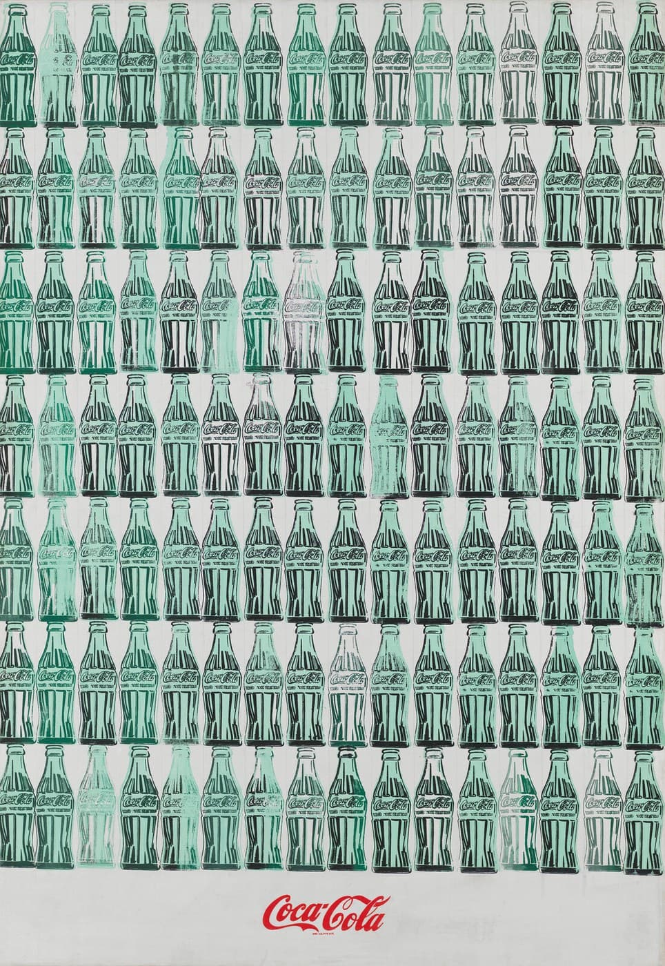
Green Coca-Cola Bottles
by Andy Warhol
One hundred and twelve Coca-Cola bottles stand in seven rows of sixteen, with the red Coca-Cola logo alone in an empty band at the foot of the canvas. Andy Warhol made it in the summer of 1962, the year he began using screen printing to make paintings. No two bottles came out the same: the green is heavy in some and missing in others, and on several the green and the black outline do not line up. The Whitney Museum of American Art bought it in 1968.
- 1962
- Acrylic, screenprint, and graphite pencil on canvas
- Whitney Museum of American ArtNew York, United States
About Andy Warhol
What the painting shows
The canvas is filled by a grid of Coca-Cola bottles, sixteen across and seven down, which comes to one hundred and twelve. Each is the standard contour bottle, drawn in black over a flat green body, with the word Coca-Cola in the company's script on the label. Below the last row the canvas is empty for about an eighth of its height, and the Coca-Cola logo sits alone in that band, in red, printed once.
The bottles are not identical. In the top-left corner one bottle is a deep forest green with every black stroke printed. The bottle directly beside it is a pale mint ghost on which the black almost entirely failed, leaving only a smear where the lettering should be. Towards the right-hand end of several rows the green thins out altogether and the bottles read as empty glass, black drawing on bare ground.
The canvas measures 210.2 by 145.1 centimetres, about six foot ten by four foot nine. The medium, as the Whitney Museum of American Art records it, is acrylic, screenprint, and graphite pencil on canvas.
How it was printed
The Whitney's own label gives a two-stage account. The green was printed first, in a grid, and the black outlines, it says, "were probably stamped by hand from a single carved woodblock onto green areas printed in a grid pattern". The museum's word is probably. It goes on to note that each bottle therefore differs "in both the evenness of the green underpainting and in the clarity of its stamped profile", and that the bottles "are also often slightly askew".
The museum's audio guide describes the making differently. Its narrator says that Andy Warhol "screened each bottle one at a time, deliberately making each different from the next". Woodblock stamping and screen printing are not the same operation, and the two statements come from the same institution about the same canvas. What both agree on is that the black went down bottle by bottle rather than in one pass.
The result is visible without any technical apparatus. On many bottles the flat green slab sits to the left of the black contour, so green spills past the outline on one side and a strip of bare ground shows inside it on the other. Straight pale bands run the full height of the canvas at roughly the width of a bottle, marking how the green was laid down. Under the red logo a line of small red type has printed as four broken clusters that no longer resolve into letters.
1962 is the year the process changed. As the art historian Michael Lobel puts it in the Whitney's audio guide, "Prior to Warhol's use of the silkscreen technique to make paintings, silkscreening had basically been a commercial technique." Warhol had spent the 1950s as a commercial illustrator in New York, and the technique came with him.
The logo where a signature goes
The empty band at the bottom is the painting's oddest decision, and Michael Lobel connects it to a convention. "He did leave a band of space at the bottom of the painting," Lobel says, "and as you'll see, within that band he placed the logo of Coca-Cola. And for me, that's interesting because usually the bottom of a canvas is where we expect to find an artist's signature." In Lobel's reading, an artist working inside consumer culture might reasonably "remove his signature and replace it with a common product logo".
The logo is the only red in the work and the only element that appears once. Everything above it repeats.
Why Coca-Cola
Warhol chose products whose design was the same for everyone who bought them. The Whitney's label quotes him on the point: "A Coke is a Coke," he explained, "and no amount of money can get you a better Coke than the one the bum on the corner is drinking."
The museum reads the painting as doing two things at once, and says so plainly: Warhol "at once criticized and glorified the consumerist idols and surface values of America's media-saturated postwar culture". The painting does not settle which. The bottles are uniform enough to read as a pattern and irregular enough to read as a hundred and twelve separate objects, and that tension is what the grid produces.
How it reached the Whitney
The Whitney Museum of American Art bought the painting in 1968, six years after it was made, with funds from the Friends of the Whitney Museum of American Art. Its accession number is 68.25.
It hung in the museum's Warhol retrospective, Andy Warhol—From A to B and Back Again, which ran from 12 November 2018 to 31 March 2019 and for which the audio guide quoted above was recorded. The Whitney lists it as on view. Gallery displays change, so check the museum's own object record before making a special visit.
Who holds the rights
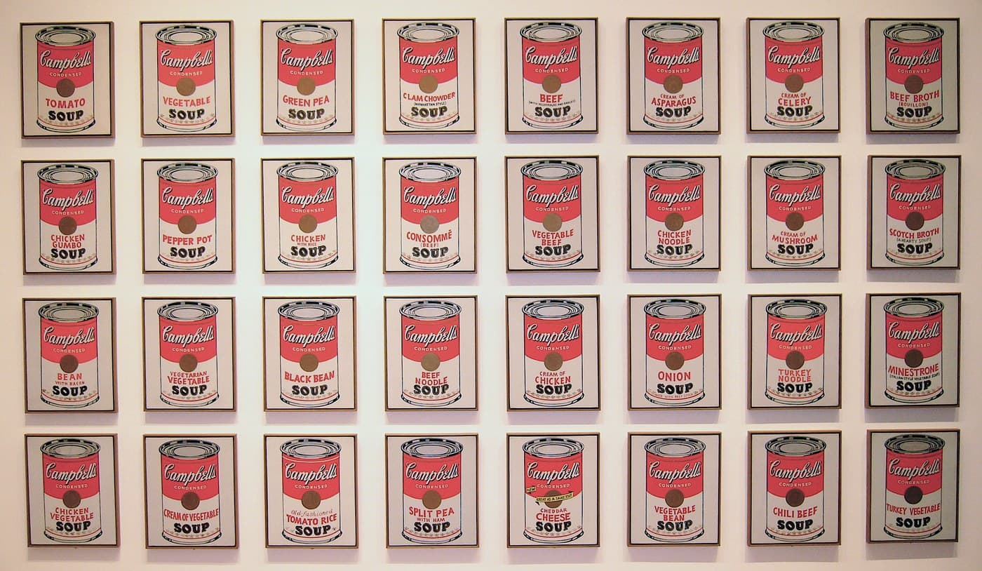
Andy Warhol died in 1987 and the painting is in copyright. The Whitney prints the notice "© The Andy Warhol Foundation for the Visual Arts, Inc. / Licensed by Artists Rights Society (ARS), New York" on its record. The Museum of Modern Art prints the same two bodies without the words "Licensed by" on its record for Campbell's Soup Cans, so the wording is not standardised between institutions even where the rights holder is.
The reproduction here is the Whitney's own photograph of the painting, shown reduced under fair use for commentary and excluded from commercial reuse.
Close reading
Reading the work, detail by detail
One hundred and twelve Coca-Cola bottles, sixteen across and seven down, over a red Coca-Cola logo at the foot of the canvas. Start with the two bottles in the top-left corner, which were printed from the same block and came out completely differently, then follow the green and the black as they separate across the grid.
1.Sixteen across, seven down
Sixteen bottles stand in each row and there are seven rows, so the canvas carries one hundred and twelve bottles. The rows sit close enough that the black base of one row almost touches the cap of the row below it.
2.The bottle in the top-left corner
This is the most heavily inked bottle on the canvas. The green reads as a dark forest green rather than the pale mint used elsewhere, and every black stroke has printed. The green slab beneath it extends past the black contour on the left side.
3.The bottle beside it, almost blank
The black failed on this pull. Where its neighbour has a full outline, this bottle keeps only a pale green body and a ghost of the lettering. It is the clearest starved impression on the canvas, and it sits directly beside the heaviest one.
4.Green and black out of register
The green was laid down first as a flat slab and the black drawing went on top. On these bottles the two do not line up: green protrudes past the left contour and a strip of bare ground shows inside the right one.
5.The Coca-Cola script on the label
The script on each label reads Coca-Cola. It is drawn as an outline rather than a solid, so the green of the label band shows through the letters. The same block printed it on every bottle.
6.The line under the script
Two clusters of smaller lettering sit below the script on every bottle. At the size the block was cut they printed as broken marks and cannot be read as words. No institutional record transcribes them.
7.The caps and necks
Each bottle is capped by a black crown with a second ring beneath it. On the middle bottle the green halo around the cap sits noticeably high and left of the black, so the cap appears to float off its own neck.
8.The flutes of the glass
The ribs of the contour bottle are set down as separate vertical strokes. Where the ink ran heavy the strokes have merged into one black mass; where it ran dry they break into dashes and the green shows between them.
9.A bottle that flooded
Too much ink went down here. The separate strokes have closed up and the bottle reads as a dark silhouette rather than as transparent glass. Its neighbours on the same row kept their internal drawing.
10.The right end of the rows
The green thins out towards the right edge. In several rows the last bottles carry the black drawing over bare ground, so they read as empty glass. The black held its density across the same span.
11.The bases
Each bottle ends in a heavy black bar. The bars are the wettest part of the printing and several have smeared outwards, so the foot of one bottle runs into the space beside it. On one bottle a green stroke overshoots below the bar.
12.Vertical bands in the ground
The ground is not an even white. Straight vertical bands run the height of the canvas at roughly the width of a bottle, marking where the green was laid down column by column before the outlines went on.
13.The red logo
The logo is the only red on the canvas and the only element printed once. It sits centred in an empty band about an eighth of the canvas deep. The art historian Michael Lobel, in the Whitney's audio guide, notes that the foot of a canvas is where a signature is usually expected.
14.The small red line under the logo
A line of small red type sits under the swash of the first C, in the position the trademark notice occupies on Coca-Cola advertising. It printed as four short clusters and does not resolve into letters.
15.Marks in the empty band
The band below the bottles is not blank. Pale grey shapes sit to the right of the logo, wiped rather than drawn, and a faint straight line runs across the ground at the level of the bottle bases.
Timeline
1962
Andy Warhol paints Green Coca-Cola Bottles in New York, in the summer, the year he begins using screen printing to make paintings.
1968
The Whitney Museum of American Art buys the painting with funds from the Friends of the Whitney Museum of American Art. Accession number 68.25.
2018–19
Shown in Andy Warhol—From A to B and Back Again at the Whitney, 12 November 2018 to 31 March 2019.
Where to see it
Whitney Museum of American Art
New York, United States
A public viewing address has not yet been confirmed for this holding.
Listed as on view by the Whitney Museum of American Art. Gallery displays change, so check the museum's own object record before making a special visit.
Frequently asked questions
How many bottles are in Green Coca-Cola Bottles?
One hundred and twelve. They stand sixteen across and seven down, which the Whitney Museum of American Art states as seven high by sixteen across, and the count holds when the bottles in the reproduction are counted row by row.
How did Andy Warhol make Green Coca-Cola Bottles?
In two stages, though the Whitney gives two accounts of the second one. Its label says the green was printed in a grid and the black outlines "were probably stamped by hand from a single carved woodblock"; its audio guide says Warhol screened each bottle one at a time. Both describe the black going down bottle by bottle rather than in a single pass.
Why are the bottles all slightly different?
Because each was printed or stamped separately. The green varies from a deep forest green to almost nothing, and several bottles sit askew in the grid. On many the green and the black outline are out of register: green spills past the contour on one side and bare ground shows inside it on the other.
Why is the Coca-Cola logo at the bottom of the painting?
It occupies the strip where a signature would normally go. The art historian Michael Lobel makes that point in the Whitney's audio guide: the foot of a canvas is where a signature is expected, and Warhol put a product logo there instead. It is the only red element and the only one that appears once.
How big is Green Coca-Cola Bottles?
210.2 by 145.1 centimetres, or 82 3/4 by 57 1/8 inches — roughly six foot ten high by four foot nine wide.
Where is Green Coca-Cola Bottles?
The Whitney Museum of American Art in New York, accession number 68.25, bought in 1968 with funds from the Friends of the Whitney Museum of American Art. The museum lists it as on view, but gallery displays change, so check the museum's own object record before making a special visit.
More by Andy Warhol
If you like Andy Warhol
Explore painters from the same movements and circles.
Marcel Duchamp
The century's quietest revolutionary — readymades, the abandonment of painting, chess on a Paris rooftop in Entr'acte, and one anemic film of spinning puns signed Rrose Sélavy.
View artist
Tarsila do Amaral
Brazilian painter who spent the 1920s moving between São Paulo and Paris, studied Cubism under André Lhote, Albert Gleizes and Fernand Léger, and used what she learned to paint Brazilian towns, railways, plants and bodies. Her 1928 painting Abaporu prompted the manifesto that gave the Anthropophagic movement its name.
View artist
Vincent van Gogh
Dutch painter who lived in Montmartre with his brother Theo from March 1886 to February 1888 — the two years in which his dark Dutch palette turned into colour. He painted more than 200 pictures in Paris and died at Auvers-sur-Oise, north of the city, in 1890.
View artist
References
The sources below include collection records, catalogues, scholarly research, and primary materials that informed this page. They document Green Coca-Cola Bottles, its making, and its place in cultural history.

1Andy Warhol, Green Coca-Cola Bottles (1962) — object record, 68.25
Official recordWhitney Museum of American Art, New YorkUsed forThe holding museum's object record: the 1962 date, the medium, the dimensions, the accession number, the credit line, the on-view status, the Artists Rights Society notice, the label's account of the woodblock stamping and the seven-by-sixteen grid, and the audio guide in which Michael Lobel discusses the logo at the foot of the canvas.

2Images and permissions
WebsiteWhitney Museum of American Art, New YorkUsed forThe Whitney's own statement that clearance must be obtained from Artists Rights Society before it will agree to publication of an image carrying that credit.
3Represented artists
WebsiteArtists Rights Society, New YorkUsed forWeb source consulted for documented facts and historical context presented on the Green Coca-Cola Bottles page.
4Andy Warhol's Life — the museum's biography
WebsiteThe Andy Warhol Museum, PittsburghUsed forThe Andy Warhol Museum on the 1950s commercial-illustration career and the move to screen printing in 1962.
5Andy Warhol—From A to B and Back Again (12 November 2018 – 31 March 2019)
WebsiteWhitney Museum of American Art, New YorkUsed forThe Whitney's 2018–19 retrospective, for which the audio guide quoted here was recorded.
These references provide the documented foundation for this work's history and interpretation. Claim-level citations remain attached to the specific claims they support.
 Explore more resources